


Unity of line is a bigger quality than variety, and as it requires a larger mental grasp, is more rarely met with. The bigger things in drawing and design come under its consideration, including, as it does, the relation of the parts to the whole. Its proper consideration would take us into the whole field of Composition, a subject needing far more consideration than it can be given in this book.
In almost all compositions a rhythmic flow of lines can be traced. Not necessarily a flow of actual lines (although these often exist); they may be only imaginary lines linking up or massing certain parts, and bringing them into conformity with the rhythmic conception of the whole. Or again, only a certain stress and flow in the forms, suggesting line movements. But these line movements flowing through your panel are of the utmost importance; they are like the melodies and subjects of a musical symphony, weaving through and linking up the whole composition.
Often, the line of a contour at one part of a picture is picked up again by the contour of some object at another part of the composition, and although no actual line connects them, a unity is thus set up between them. (See diagrams, pages 166 and 168, illustrating line compositions of pictures by Botticelli and Paolo Veronese). This imaginary following through of contours across spaces in a composition should always be looked out for and sought after, as nothing serves to unite a picture like this relationship of remote parts. The flow of these lines will depend on the nature of the subject: they will be more gracious and easy, or more vigorous and powerful, according to the demands of your subject.
This linking up of the contours applies equally well to the drawing of a single figure or even a head or hand, and the student should always be on the look out for this uniting quality. It is a quality of great importance in giving unity to a composition.
When groups of lines in a picture occur parallel to each other they produce an accentuation of the particular quality the line may contain, a sort of sustained effect, like a sustained chord on an organ, the effect of which is much bigger than that of the same chord struck staccato. This sustained quality has a wonderful influence in steadying and uniting your work.
This parallelism can only be used successfully with the simplest lines, such as a straight line or a simple curve; it is never advisable except in decorative patterns to be used with complicated shapes. Blake is very fond of the sustained effect parallelism gives, and uses the repetition of curved and straight lines very often in his compositions. Note in Plate I of the Job series, page 146 [Transcribers Note: Plate XXXI], the use made of this sustaining quality in the parallelism of the sheep's backs in the background and the parallel upward flow of the lines of the figures. In Plate II you see it used in the curved lines of the figures on either side of the throne above, and in the two angels with the scroll at the left-hand corner. Behind these two figures you again have its use accentuating by repetition the peaceful line of the hacks of the sheep. The same thing can be seen in Plate XXXI, B, where the parallelism of the back lines of the sheep and the legs of the seated figures gives a look of peace contrasting with the violence of the messenger come to tell of the destruction of Job's sons. The emphasis that parallelism gives to the music of particular lines is well illustrated in all Blake's work. He is a mine of information on the subject of line rhythm. Compare A with Plate XXXI, C; note how the emotional quality is dependent in both cases on the parallelism of the upward flow of the lines. How also in Plate I he has carried the vertical feeling even into the sheep in the front, introducing little bands of vertical shading to carry through the vertical lines made by the kneeling figures. And in the last plate, "So the Lord blessed the latter end of Job more than the beginning," note how the greater completeness with which the parallelism has been carried out has given a much greater emphasis to the effect, expressing a greater exaltation and peace than in Plate XXXI, A. Notice in Plate XXXI, D, where "The just, upright man is laughed to scorn," how this power of emphasis is used to increase the look of scorn hurled at Job by the pointing fingers of his three friends.
Of the use of this principle in curved forms, the repetition of the line of the back in stooping figures is a favourite device with Blake. There will be found instances of this in Plate XXXII, E and G. (Further instances will be found on reference to Plates VII, VIII, XIII, and XVII, in Blake's Job.) In the last instance it is interesting to note how he has balanced the composition, which has three figures kneeling on the right and only one on the left. By losing the outline of the third figure on the right and getting a double line out of the single figure on the left by means of the outline of the mass of hair, and also by shading this single figure more strongly, he has contrived to keep a perfect balance. The head of Job is also turned to the left, while he stands slightly on that side, still further balancing the three figures on the right. (This does not show so well in the illustration here reproduced as in the original print.)

Plate XXXI.
Thus did Job continually. (Plate I, Blake's Job)
And I only am escaped alone to tell thee. (Plate IV, Blake's Job)
So the Lord blessed the latter end of Job more than the beginning. (Plate XXI, Blake's Job)
The just upright man is laughed to scorn. (Plate X, Blake's Job)
Some rude things were said above about the straight line and the circle, on account of their lack of variety, and it is true that a mathematically straight line, or a mathematically perfect circle, are never found in good artistic drawing. For without variety is no charm or life. But these lines possess other qualities, due to their maximum amount of unity, that give them great power in a composition; and where the expression of sublimity or any of the deeper and more profound sentiments are in evidence, they are often to be found.
The rows of columns in a Greek temple, the clusters of vertical lines in a Gothic cathedral interior, are instances of the sublimity and power they possess. The necessary play that makes for vitality—the "dither" as we called this quality in a former chapter—is given in the case of the Greek temple by the subtle curving of the lines of columns and steps, and by the rich variety of the sculpture, and in the case of the Gothic cathedral by a rougher cutting of the stone blocks and the variety in the 148colour of the stone. But generally speaking, in Gothic architecture this particular quality of "dither" or the play of life in all the parts is conspicuous, the balance being on the side of variety rather than unity. The individual workman was given a large amount of freedom and allowed to exercise his personal fancy. The capitals of columns, the cusping of windows, and the ornaments were seldom repeated, but varied according to the taste of the craftsman. Very high finish was seldom attempted, the marks of the chisel often being left showing in the stonework. All this gave a warmth and exuberance of life to a fine Gothic building that makes a classical building look cold by comparison. The freedom with which new parts were built on to a Gothic building is another proof of the fact that it is not in the conception of the unity of the whole that their chief charm consists.
On the other hand, a fine classic building is the result of one large conception to which every part has rigorously to conform. Any addition to this in after years is usually disastrous. A high finish is always attempted, no tool marks nor any individuality of the craftsman is allowed to mar the perfect symmetry of the whole. It may be colder, but how perfect in sublimity! The balance here is on the side of unity rather than variety.
The strength and sublimity of Norman architecture is due to the use of circular curves in the arches, combined with straight lines and the use of square forms in the ornaments—lines possessed of least variety.
All objects with which one associates the look of strength will be found to have straight lines in their composition. The look of strength in a strong man is due to the square lines of the contours, so different from the rounded forms of a fat man. And everyone knows the look of mental power a square forehead gives to a head and the look of physical power expressed by a square jaw. The look of power in a rocky landscape or range of hills is due to the same cause.
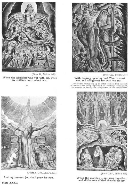
Plate XXXII.
When the Almighty was yet with me, when my children were about me. (Plate II, Blake's Job)
With dreams upon my bed Thou scarest me, and affrightest me with visions. (Plate XI, Blake's Job)
Printed the wrong way up in order to show that the look of horror is not solely dependent on the things represented but belongs to the rhythm, the pattern of the composition.
And my servant Job shall pray for you. (Plate XVIII, Blake's Job)
When the morning-stars sang together, and all the sons of God shouted for joy. (Plate XIV, Blake's Job)
The horizontal and the vertical are two very important lines, the horizontal being associated with calm and contemplation and the vertical with a feeling of elevation. As was said above, their relation to the sides of the composition to which they are parallel in rectangular pictures is of great importance in uniting the subject to its bounding lines and giving it a well-knit look, conveying a feeling of great stability to a picture.
How impressive and suggestive of contemplation is the long line of the horizon on a calm day at sea, or the long, horizontal line of a desert plain! The lack of variety, with all the energy and vitality that accompany it, gives one a sense of peace and rest, a touch of infinity that no other lines can convey. The horizontal lines which the breeze makes on still water, and which the sky often assumes at sunset, affect us from the same harmonic cause.
The stone pine and the cypress are typical instances of the sublime associated with the vertical in nature. Even a factory chimney rising above a distant town, in spite of its unpleasant associations, is impressive, not to speak of the beautiful spires of some of our Gothic cathedrals, pointing upwards. How well Constable has used the vertical sublimity of the spire of Salisbury Cathedral can be seen in his picture, at the Victoria and Albert Museum, where he has contrasted it with the gay tracery of an arch 150of elm trees. Gothic cathedrals generally depend much on this vertical feeling of line for their impressiveness.
The Romans knew the expressive power of the vertical when they set up a lonely column as a monument to some great deed or person. And a sense of this sublimity may be an unconscious explanation of the craze for putting towers and obelisks on high places that one comes across in different parts of the country, usually called someone's "folly."
In the accompanying diagrams, A, B, C and D, E, F, pages 152 [Transcribers Note: Diagram X] and 153 [Transcribers Note: Diagram XI], are examples of the influence to be associated with the horizontal and vertical lines. A is nothing but six straight lines drawn across a rectangular shape, and yet I think they convey something of the contemplative and peaceful sense given by a sunset over the sea on a calm evening. And this is entirely due to the expressive power straight lines possess, and the feelings they have the power to call up in the mind. In B a little more incident and variety has been introduced, and although there is a certain loss of calm, it is not yet enough to destroy the impression. The line suggesting a figure is vertical and so plays up to the same calm feeling as the horizontal lines. The circular disc of the sun has the same static quality, being the curve most devoid of variety. It is the lines of the clouds that give some excitement, but they are only enough to suggest the dying energy of departing day.
Now let us but bend the figure in a slight curve, as at C, and destroy its vertical direction, partly cover the disc of the sun so as to destroy the complete circle, and all this is immediately altered, our 151calm evening has become a windy one, our lines now being expressive of some energy.

PLATE XXXIII.
FÊTE CHAMPÊTRE. GIORGIONI (LOUVRE)
Note the straight line introduced in seated female figure with flute to counteract rich forms.
To take a similar instance with vertical lines. Let D represent a row of pine trees in a wide plain. Such lines convey a sense of exaltation and infinite calm. Now if some foliage is introduced, as at E, giving a swinging line, and if this swinging line is carried on by a corresponding one in the sky, we have introduced some life and variety. If we entirely destroy the vertical feeling and bend our trees, as at F, the expression of much energy will be the result, and a feeling of the stress and struggle of the elements introduced where there was perfect calm.
It is the aloofness of straight lines from all the fuss and flurry of variety that gives them this calm, infinite expression. And their value as a steadying influence among the more exuberant forms of a composition is very great. The Venetians knew this and made great use of straight lines among the richer forms they so delighted in.
It is interesting to note how Giorgione in his "Fête Champêtre" of the Louvre (see illustration, page 151 [Transcribers Note: Plate XXXIII]), went out of his way to get a straight line to steady his picture and contrast with the curves. Not wanting it in the landscape, he has boldly made the contour of the seated female conform to a rigid straight line, accentuated still further by the flute in her hand. If it were not for this and other straight lines in the picture, and a certain squareness of drawing in the draperies, the richness of the trees in the background, the full forms of the flesh and drapery would be too much, and the effect become sickly, if not positively sweet. Van Dyck, also, used to go out of his way to introduce a hard straight line near the head in his portraits for the same 154reason, often ending abruptly, without any apparent reason, a dark background in a hard line, and showing a distant landscape beyond in order to get a light mass to accentuate the straight line.

Diagram X.
ILLUSTRATING, A, CALM RHYTHMIC INFLUENCE OF HORIZONTAL LINES SUCH AS A SUNSET OVER THE SEA MIGHT GIVE; B, INTRODUCTION OF LINES CONVEYING SOME ENERGY; C, SHOWING DESTRUCTION OF REPOSE BY FURTHER CURVING OF LINES. THE CALM EVENING HAS BECOME A WINDY ONE.

Diagram XI.
ILLUSTRATING, D, RHYTHMIC INFLUENCE OF VERTICAL LINES; E, THE INTRODUCTION OF SOME VARIETY; F, THE DESTRUCTION OF THE VERTICAL AND CONSEQUENT LOSS OF REPOSE.
The rich modelling and swinging lines of the "Bacchus and Ariadne" of Titian in the National Gallery, here reproduced, page 154 [Transcribers Note: Plate XXXIV], would be too gross, were it not for the steadying influence of the horizontal lines in the sky and the vertical lines of the tree-trunks.
While speaking of this picture, it might not be out of place to mention an idea that occurred to me as to the reason for the somewhat aggressive standing leg of the female figure with the cymbals leading the procession of revellers. I will not attempt any analysis of this composition, which is ably gone into in another book of this series. But the standing leg of this figure, given such prominence in the composition, has always rather puzzled me. I knew Titian would not have given it that vigorous stand without a good reason. It certainly does not help the run of the composition, although it may be useful in steadying it, and it is not a particularly beautiful thing in itself, as the position is one better suited to a man's leg than to a woman's. But if you cover it over with your finger and look at the composition without it, I think the reason of its prominence becomes plainer. Titian evidently had some trouble, as well he might have, with the forward leg of the Bacchus. He wished to give the look of his stepping from the car lightly treading the air, as gods may be permitted to do. But the wheel of the car that comes behind the foot made it difficult to evade the idea that he was stepping on it, which would be the way an ordinary mortal would alight. I think the duty of the aggressive standing leg of the leading Bacchante, with its great look of weight, is to give a look of lightness to this forward leg of Bacchus, by contrast—which it certainly does. On examining the picture closely in a good light, you will see that he has had the foot of Bacchus in several positions before he got it right. Another foot can distinctly be seen about a couple of inches or so above the present one. The general vertical direction of this leg is also against its look of lightness and motion, tending rather to give it a stationary, static look. I could not at first see why he did not bring the foot further to the right, which would have aided the lightness of the figure and increased its movement. But you will observe that this would have hurled the whole weight of the mass of figures on the right, forward on to the single figure of Ariadne, and upset the balance; as you can see by covering this leg with your finger and imagining it swinging to the right. So that Titian, having to retain the vertical position for Bacchus' forward leg, used the aggressive standing leg of the cymbal lady to accentuate its spring and lightness.

Plate XXXIV.
BACCHUS AND ARIADNE. TITIAN
Photo Hanfstaengl
A feeling of straight-up-ness in a figure or of the horizontal plane in anything will produce the same effect as a vertical or horizontal line without any actual line being visible. Blake's "Morning Stars Singing Together" is an instance of the vertical chord, although there is no actual upright line in the figures. But they all have a vigorous straight-up-ness that gives them the feeling of peace and elevation coupled with a flame-like line running through them that gives them their joyous energy.

Diagram XII.
A, B, C
The combination of the vertical with the horizontal produces one of the strongest and most arresting chords that you can make, and it will be found to exist in most pictures and drawings where there is the expression of dramatic power. The cross is the typical example of this. It is a combination of lines that instantly rivets the attention, and has probably a more powerful effect upon the mind—quite apart from anything symbolised by it—than any other simple combinations that could have been devised. How powerful is the effect of a vertical figure, or even a post, seen cutting the long horizontal line of the horizon on the sea-shore. Or a telegraph post by the side of the road, seen against the long horizontal line of a hill at sunset. The look of power given by the vertical lines of a contracted brow is due to the same cause. The vertical furrows of the brow continuing the lines of the nose, make a continuous vertical which the horizontal lines of the brow cross (see Fig. A in the illustration). The same cause gives the profile a powerful look when the eyebrows make a horizontal line contrasting with the vertical line of the forehead (Fig. B). Everybody knows the look of power associated with a square brow: it is not that the square forehead gives the look of a larger brain capacity, for if the forehead protrudes in a curved line, as at C, the look of power is lost, although there is obviously more room for brains.
This power of the right angle is well exemplified in Watts' "Love and Death," here reproduced, page 158 [Transcribers Note: Plate XXXV]. In this noble composition, in the writer's opinion one of the most sublime expressions produced by nineteenth-century art, the irresistible power and majesty of the slowly advancing figure of Death is largely due to the right angle felt through the pose. Not getting it in the contour, Watts has boldly introduced it by means of shading the farther arm and insisting on the light upper edge of the outstretched arm and hand, while losing somewhat the, outline of the head beyond. Note also the look of power the insistence on square forms in the drapery gives this figure. The expression is still further emphasised by the hard square forms of the steps, and particularly by the strong horizontal line of the first step so insisted on, at right angles to the vertical stand of the figure; and also the upright lines of the doorway above. In contrast with the awful sublimity of this figure of Death, how touching is the expression of the little figure of Love, trying vainly to stop the inevitable advance. And this expression is due to the curved lines on which the action of the figure is hung, and the soft undulating forms of its modelling. Whereas the figure of Death is all square lines and flat crisp planes, the whole hanging on a dramatic right angle; this figure is all subtle fullness both of contour and modelling melting one into the other, the whole hung upon a rich full curve starting at the standing foot of the advancing figure. And whereas the expression of Death is supported and emphasised by the hard, square forms and texture of the stone steps, the expression of Love is supported and emphasised by the rounded forms and soft texture of the clustering roses. On this contrast of line and form, so in sympathy with the profound sentiment to which this picture owes its origin, the expressive power of this composition will be found to depend.

Diagram XIII.
ILLUSTRATING SOME OF THE LINES ON WHICH THE RHYTHMIC POWER OF THIS PICTURE DEPENDS.

Plate XXXV.
LOVE AND DEATH. BY G.F. WATTS
A noble composition, founded on the power of the right angle in the figure of Death, in contrast with the curved lines in the figure of Love. (See diagram opposite.)
Photo Hollyer
In the diagram accompanying the reproduction of this picture I have tried to indicate in diagrammatical form some of the chief lines of its anatomy.
In these diagrams of the anatomy of compositions the lines selected are not always very obvious in the originals and are justly much broken into by truths of natural appearance. But an emotional significance depending on some arrangement of abstract lines is to be found underlying the expression in every good picture, carefully hidden as it is by all great artists. And although some apology is perhaps necessary for the ugliness of these diagrams, it is an ugliness that attends all anatomy drawings. If the student will trace them and put his tracing over the reproductions of the originals, they will help him to see on what things in the arrangement the rhythmic force of the picture depends.
Other lines, as important as those selected, may have been overlooked, but the ones chosen will suffice to show the general character of them all.
There is one condition in a composition, that is laid down before you begin, and that is the shape of your panel or canvas. This is usually a rectangular form, and all the lines of your design will have to be considered in relation to this shape. Vertical and horizontal lines being parallel to the boundaries of rectangular pictures, are always right and immediately set up a relationship, as we have seen.
The arresting power of the right angle exists at each corner of a rectangular picture, where the vertical sides meet the horizontal base, and this presents a difficulty, because you do not wish the spectator's attention drawn to the corners, and this dramatic combination of lines always attracts the eye. A favourite way of getting rid of this is to fill them with some dark mass, or with lines swinging round and carrying the eye past them, so that the attention is continually swung to the centre of the picture. For lines have a power of directing the attention, the eye instinctively running with them, and this power is of the greatest service in directing the spectator to the principal interest.
It is this trouble with the corners that makes the problem of filling a square so exacting. In an ordinary rectangular panel you have a certain amount of free space in the middle, and the difficulty of filling the corners comfortably does not present itself until this space is arranged for. But in a square, the moment you leave the centre you are in one or other of the corners, and the filling of them governs the problem much more than in the case of other shapes. It is a good exercise for students to give themselves a square to fill, in order to understand this difficulty and learn to overcome it.
Other lines that possess a direct relation to a rectangular shape are the diagonals. Many compositions that do not hang on a vertical or horizontal basis are built on this line, and are thus related to the bounding shape.
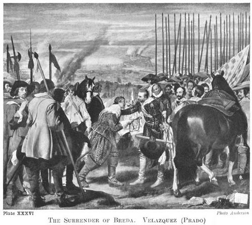
Plate XXXVI.
THE SURRENDER OF BREDA VELAZQUEZ (PRADO)
Photo Anderson
When vertical, horizontal, or diagonal lines are referred to, it must not be assumed that one means in all cases naked lines. There is no pure vertical line in a stone pine or cypress tree, nor pure horizontal 161line in a stretch of country, but the whole swing of their lines is vertical or horizontal. And in the same way, when one speaks of a composition being hung upon a diagonal, it is seldom that a naked diagonal line exists in the composition, but the general swing is across the panel in harmony with one or other diagonal. And when this is so, there is a unity set up between the design and its boundaries. A good instance of vertical, horizontal, and diagonal lines to unite a picture is Velazquez's "The Surrender of Breda," here reproduced. Note the vertical chord in the spears on the left, continued in the leg of the horse and front leg of the figure receiving the key, and the horizontal line made by the dark mass of distant city, to be continued by the gun carried over the shoulder of the figure with the slouch hat behind the principal group. Velazquez has gone out of his way to get this line, as it could hardly have been the fashion to carry a gun in this position, pointing straight at the head of the man behind. Horizontal lines also occur in the sky and distant landscape, one running right through the group of spears. The use of the diagonal is another remarkable thing in the lines of this picture. If you place a ruler on the slanting line of the flag behind the horse's head to the right, you find it is exactly parallel to a diagonal drawn from the top right-hand corner to the lower left-hand corner. Another line practically parallel to this diagonal is the line of the sword belonging to the figure offering the key, the feeling of which is continued in the hand and key of this same figure. It may be noted also that the back right leg of the horse in the front is parallel to the other diagonal, the under side of it being actually on the diagonal and thus brought into relation with the bounding lines of the picture. And all these lines, without the artifice being too apparent, give that well-knit, dignified look so in harmony with the nature of the subject.
Curved lines have not the moral integrity of straight lines. Theirs is not so much to minister to the expression of the sublime as to woo us to the beauteous joys of the senses. They hold the secrets of charm. But without the steadying power of straight lines and flatnesses, curves get out of hand and lose their power. In architecture the rococo style is an example of this excess. While all expressions of exuberant life and energy, of charm and grace depend on curved lines for their effect, yet in their most refined and beautiful expression they err on the side of the square forms rather than the circle. When the uncontrolled use of curves approaching the circle and volute are indulged in, unrestrained by the steadying influence of any straight lines, the effect is gross. The finest curves are full of restraint, and excessive curvature is a thing to be avoided in good drawing. We recognise this integrity of straight lines when we say anybody is "an upright man" or is "quite straight," wishing to convey the impression of moral worth.
Rubens was a painter who gloried in the unrestrained expression of the zeal to live and drink deeply of life, and glorious as much of his work is, and wonderful as it all is, the excessive use of curves and rounded forms in his later work robs it of much of its power and offends us by its grossness. His best work is full of squarer drawing and planes.
163Always be on the look out for straightnesses in curved forms and for planes in your modelling.
Let us take our simplest form of composition again, a stretch of sea and sky, and apply curved lines where we formerly had straight lines. You will see how the lines at A, page 164 [Transcribers Note: Diagram XIV], although but slightly curved, express some energy, where the straight lines of our former diagram expressed repose, and then how in B and C the increasing curvature of the lines increases the energy expressed, until in D, where the lines sweep round in one vigorous swirl, a perfect hurricane is expressed. This last, is roughly the rhythmic basis of Turner's "Hannibal Crossing the Alps" in the Turner Gallery.
One of the simplest and most graceful forms the tying lines of a composition may take is a continuous flow, one line evolving out of another in graceful sequence, thus leading the eye on from one part to another and carrying the attention to the principal interests.
Two good instances of this arrangement are Botticelli's "Birth of Venus" and the "Rape of Europa," by Paolo Veronese, reproduced on pages 166 [Transcribers Note: Diagram XV, Plate XXXVII] and 168 [Transcribers Note: Diagram XVI, Plate XXXVIII]. The Venetian picture does not depend so much on the clarity of its line basis as the Florentine. And it is interesting to note how much nearer to the curves of the circle the lines of Europa approach than do those of the Venus picture. Were the same primitive treatment applied to the later work painted in the oil medium as has been used by Botticelli in his tempera picture, the robustness of the curves would have offended and been too gross for the simple formula; whereas overlaid and hidden under such a rich abundance of natural truth as it is in this gorgeous picture, we are too much distracted and entertained by such wealth to have time to dwell on the purity of the line arrangement at its base. And the rich fullness of line arrangement, although rather excessive, seen detached, is in keeping with the sumptuous luxuriance the Venetian loved so well to express. But for pure line beauty the greater restraint of the curves in Botticelli's picture is infinitely more satisfying, though here we have not anything like the same wealth and richness of natural appearance to engage our attention, and the innocent simplicity of the technique leaves much more exposed the structure of lines, which in consequence play a greater part in the effect of the picture.

Diagram XIV.
ILLUSTRATING POWER OF CURVED LINES TO CONVEY ENERGY. A, B, C, D.

Diagram XIV.
ILLUSTRATING POWER OF CURVED LINES TO CONVEY ENERGY. A, B, C, D.

Diagram XV.
ILLUSTRATING THE FLOW OF LINES ON WHICH THE RHYTHMIC UNITY OF THIS PICTURE DEPENDS.

Plate XXXVII.
THE BIRTH OF VENUS. BOTTICELLI (FLORENCE)
A beautiful example of Botticelli's refined line rhythm. (See diagram on opposite page for analysis.)
Photo Anderson
In both cases note the way the lines lead up to the principal subject, and the steadying power introduced by means of horizontal, vertical, and other straight lines. Veronese has contented himself with keeping a certain horizontal feeling in the sky, culminating in the straight lines of the horizon and of the sea edge. And he has also introduced two pyramids, giving straight lines in among the trees, the most pronounced of which leads the eye straight on to the principal head.
Botticelli has first the long line of the horizon echoed in the ground at the right-hand lower corner. And then he has made a determined stand against the flow of lines carrying you out of the picture on the right, by putting straight, upright trees and insisting upon their straightness.

Diagram XVI.
ILLUSTRATING SOME OF THE MAIN LINES ON WHICH THE RHYTHMIC UNITY OF THIS PICTURE DEPENDS.

Plate XXXVIII.
THE RAPE OF EUROPA. BY PAOLO VERONESE (VENICE)
A composition of rich full forms and rich full colour. (See the diagram on opposite page for analysis of line rhythm.)
Photo Anderson
Another rhythmic form the lines at the basis of a composition may take is a flame-like flow of lines; curved lines meeting and parting and meeting again, or even crossing in one continual movement onwards. A striking instance of the use of this 169quality is the work of the remarkable Spanish painter usually called El Greco, two of whose works are here shown (page 172 [Transcribers Note: Plate XL]). Whatever may be said by the academically minded as to the incorrectness of his drawing, there can be no two opinions as to the remarkable rhythmic vitality of his work. The upward flow of his lines and the flame-like flicker of his light masses thrills one in much the same way as watching a flaring fire. There is something exalting and stimulating in it, although, used to excess as he sometimes uses it, it is apt to suffer from lack of repose. Two examples of his pictures are reproduced here, and illustrate his use of this form of movement in the lines and masses of his compositions. Nowhere does he let the eye rest, but keeps the same flickering movement going throughout all his masses and edges. The extraordinary thing about this remarkable painter is that while this restless, unrestrained form of composition makes his work akin to the rococo work of a later period, there is a fiery earnestness and sincerity in all he does, only to be matched among the primitive painters of the fourteenth and fifteenth centuries, and very different from the false sentiment of the later school.
Blake was also fond of this flame line, but usually used it in combination with more straight lines than the energetic Spaniard allowed himself. Plates III and V in the Job series are good examples of his use of this form. In both cases it will be seen that he uses it in combination with the steadying influence of straight lines, which help to keep the balance and repose necessary in the treatment of even the most violent subjects in art.
A continual interruption in the flow of lines, and a harsh jarring of one against another in an angular, jagged fashion, produces a feeling of terror and horror. A streak of fork lightning is a natural example of this. The plate of Blake's No. XI, p. 148 [Transcribers Note: Plate XXXII], reproduced here, is also a good example. I have had it put sideways on so that you may see that the look of horror is not only in the subject but belongs to the particular music of line in the picture. The effect of the harsh contrasts in the lines is further added to by the harsh contrasts of tone: everywhere hard lights are brought up against hard darks. Harsh contrasts of tone produce much the same look of terror as harsh contrasts of line. Battle pictures are usually, when good, full of these clashes of line and tone, and thrilling dramatic effects in which a touch of horror enters are usually founded on the same principle. In the picture by Paolo Uccello in the National Gallery, reproduced on page 170 [Transcribers Note: Plate XXXIX], a milder edition of this effect is seen. The artist has been more interested in the pageantry of war and a desire to show off his newly-acquired knowledge of perspective, than anything very terrible. The contrasts of line are here but confined to the smaller parts, and there are no contrasts of light and shade, chiaroscuro not being yet invented. However, it will be seen by the accompanying diagram how consistently the harsh contrasts of line were carried out in the planning of this picture. Notice the unconscious humour of the foreshortened spears and figure carefully arranged on the ground to vanish to the recently discovered vanishing point.

Diagram XVII.
SHOWING THE CLASH OF LINES IN SYMPATHY WITH THE MARTIAL NATURE OF THIS SUBJECT.
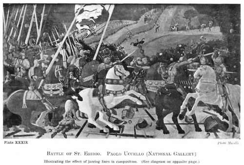
Plate XXXIX.
BATTLE OF ST. EGIDIO. PAOLO UCCELLO (NATIONAL GALLERY)
Illustrating the effect of jarring lines in composition. (See diagram on opposite page.)
Photo Morelli
Lines radiating in smooth curves from a common centre are another form employed to give unity in pictorial design. The point from which they radiate need not necessarily be within the picture, and is often considerably outside it. But the feeling that they would meet if produced gives them a unity that brings them into harmonious relationship.
There is also another point about radiating lines, and that is their power of setting up a relationship between lines otherwise unrelated. Let us try and explain this. In Panel A, page 174 [Transcribers Note: Diagram XVIII], are drawn some lines at random, with the idea of their being as little related to each other as possible. In B, by the introduction of radiating lines in sympathy with them, they have been brought into some sort of relationship. The line 1-2 has been selected as the dominating line, and an assortment of radiating ones drawn about it. Now, by drawing 7-8, we have set up a relationship between lines 3-4, 5-6, and 1-2, for this line radiates with all of them. Line 9-10 accentuates this relationship with 1-2. The others echo the same thing. It is this echoing of lines through a composition that unites the different parts and gives unity to the whole.
The crossing of lines at angles approaching the right angle is always harsh and somewhat discordant, useful when you want to draw attention dramatically to a particular spot, but to be avoided or covered up at other times. There is an ugly clash of crossing lines in our original scribble, and at C we have introduced a mass to cover this up, and also the angles made by line 3-4 as it crosses the radiating lines above 1-2. With a small mass at 11 to make the balance right, you have a basis for a composition, Diagram C, not at all unpleasing in arrangement, although based on a group of discordant lines drawn at random, but brought into harmony by means of sympathetic radiation.

Plate XL.
THE ASCENSION OF CHRIST. BY DOMINICO THEOTOCOPULI CALLED EL GRECO.
Note the flame-like form and flow of the light masses, and the exalted feeling this conveys.
Photo Anderson

Plate XLI.
THE BAPTISM OF CHRIST. BY DOMINICO THEOTOCOPULI CALLED EL GRECO
Another example of his restless, flame-like composition.
Photo Anderson
173In Panel D the same group is taken, but this time line 3-4 is used as the dominant one. Line 7-8 introduces 3-4 to 1-2, as it is related to both. Lines 9-10 and 11-12 introduce 3-4 to 5-6, as they are related to both, and the others follow on the same principle. By introducing some masses covering up the crossings, a rhythmic basis for a composition (Diagram E) entirely different from C is obtained, based on the same random group.
In Panel F, 1-2 has been taken as the dominant line, and sympathetic lines drawn on the same principle as before. By again covering the crossings and introducing balancing masses we obtain yet another arrangement from the same random scribble.
I would suggest this as a new game to students, one giving another two or three lines drawn in a panel at random, the problem being to make harmonious arrangements by the introduction of others radiating in sympathy.
Often in a picture certain conditions are laid down to start with; something as ugly as our original group of lines drawn at random has to be treated pictorially, and it is by means such as here suggested that its discordancy can be subdued and the whole brought into harmony with the shape of your panel. The same principles apply in colour, discordant notes can be brought into harmony by the introduction of others related to both the original colours, thus leading the eye from one to the other by easy stages and destroying the shock. Somewhat in the way a musician will take you from one key into another very remote by means of a few chords leading from the one to the other; whereas, had he taken you straight there, the shock would have been terrible. As it is, these transitions from one key into another please and surprise one, and are very effective.

Diagram XVIII.
SHOWING HOW LINES UNRELATED CAN BE BROUGHT INTO HARMONY BY THE INTRODUCTION OF OTHERS IN SYMPATHY WITH THEM.
A. LINES DRAWN AT RANDOM.
B. TAKING LINE 1-2 AS DOMINANT LINE.
C. AS AT B BUT WITH ADDITION OF MASSES TO COVER LINES CROSSING AND RESTORE BALANCE
D. TAKING LINE 3-4 AS DOMINANT LINE
E. AS AT D BUT WITH ADDITION OF MASSES TO COVER LINES CROSSING AND GIVE BALANCE
F. TAKING LINE 5-6 AS DOMINANT LINE
G. AS AT F BUT WITH MASSES TO COVER LINES CROSSING & TO GIVE BALANCE

Diagram XIX.
SHOWING HOW LINES UNRELATED CAN BE BROUGHT INTO HARMONY BY THE INTRODUCTION OF OTHERS IN SYMPATHY WITH THEM.
H. LINES DRAWN AT RANDOM.
I. LINES DRAWN AT RANDOM.
J. ADDITIONAL LINES DRAWN TO RELATE ORIGINAL LINES AND BRING THE WHOLE INTO HARMONY TAKING LINE 1-2, AS DOMINANT.
K. ADDITIONAL LINES DRAWN TO RELATE ORIGINAL LINES TAKING 1-2 AS DOMINANT.
L. THE SAME AS J WITH ADDITION OF MASSES TO COVER CROSSING OF LINES.
M. THE SAME AS AT K WITH ADDITION OF MASSES TO COVER CROSSING LINES.
In H, I have introduced a straight line into our 176initial scribble, and this somewhat increases the difficulties of relating them. But by drawing 7-8 and 9-10 radiating from 1-2, we have introduced this straight line to 5-6. For although 5-6 and 9-10 do not radiate from the same point, they are obviously in sympathy. It is only a short part of the line at the end marked 5 that is out of sympathy, and had 5-6 taken the course of the dotted line, it would have radiated from the same point as 9-10. We still have line 3-4 to account for. But by drawing 11-12 we bring it into relationship with 5-6, and so by stages through 9-10 and 7-8 to the original straight line 1-2. Line 13-14, by being related to 3-4, 11-12, and also 5-6, still further harmonises the group, and the remainder echo 5-6 and increase the dominant swing. At L masses have been introduced, covering crossing lines, and we have a basis for a composition.
In Diagram I lines have been drawn as before, at random, but two of them are straight and at right angles, the longer being across the-centre of the panel. The first thing to do is to trick the eye out of knowing that this line is in the centre by drawing others parallel to it, leading the eye downwards to line 9-10, which is now much more important than 1-2 and in better proportion with the height of the panel. The vertical line 3-4 is rather stark and lonely, and so we' introduce two more verticals at 11-12 and 13-14, which modify this, and with another two lines in sympathy with 5-6 and leading the eye back to the horizontal top of the panel, some sort of unity is set up, the introduction of some masses completing the scheme at M.
There is a quality of sympathy set up by certain line relationships about which it is important to say something. Ladies who have the instinct for choosing a hat or doing their hair to suit their face instinctively know something of this; know that certain things in their face are emphasised by certain forms in their hats or hair, and the care that has to be taken to see that the things thus drawn attention to are their best and not their worst points.
The principle is more generally understood in relation to colour; everybody knows how the blueness of blue eyes is emphasised by a sympathetic blue dress or touch of blue on a hat, &c. But the same principle applies to lines. The qualities of line in beautiful eyes and eyebrows are emphasised by the long sympathetic curve of a picture hat, and the becoming effect of a necklace is partly due to the same cause, the lines being in sympathy with the eyes or the oval of the face, according to how low or high they hang. The influence of long lines is thus to "pick out" from among the lines of a face those with which they are in sympathy, and thus to accentuate them.
To illustrate this, on page 178 [Transcribers Note: Plate XLII] is reproduced "The Portrait of the Artist's Daughter," by Sir Edward Burne-Jones.
The two things that are brought out by the line arrangement in this portrait are the beauty of the eyes and the shape of the face. Instead of the picture hat you have the mirror, the widening circles of which swing round in sympathy with the eyes and concentrate the attention on them. That on the left (looking at the picture) being nearest the centre, has the greatest attention concentrated upon it, the lines of the mirror being more in sympathy with this than the other eye, as it is nearer the 179centre. If you care to take the trouble, cut a hole in a piece of opaque paper the size of the head and placing it over the illustration look at the face without the influence of these outside lines; and note how much more equally divided the attention is between the two eyes without the emphasis given to the one by the mirror. This helps the unity of impression, which with both eyes realised to so intense a focus might have suffered. This mirror forms a sort of echo of the pupil of the eye with its reflection of the window in the left-hand corner corresponding to the high light, greatly helping the spell these eyes hold.

Diagram XX.
INDICATING THE SYMPATHETIC FLOW OF LINES THAT GIVE UNITY TO THIS COMPOSITION.

Plate XLII.
PORTRAIT OF THE ARTIST'S DAUGHTER SIR EDWARD BURNE-JONES, BART.
An example of sympathetic rhythm. (See diagram on opposite page.)
Photo Hollyer
The other form accentuated by the line arrangement is the oval of the face. There is the necklace the lines of which lead on to those on the right in the reflection. It is no mere accident that this chain is so in sympathy with the line of the face: it would hardly have remained where it is for long, and must have been put in this position by the artist with the intention (conscious or instinctive) of accentuating the face line. The line of the reflection on the left and the lines of the mirror are also sympathetic. Others in the folds of the dress, and those forming the mass of the hands and arms, echo still further this line of the face and bring the whole canvas into intense sympathetic unity of expression.
The influence that different ways of doing the hair may have on a face is illustrated in the accompanying scribbles. The two profiles are exactly alike—I took great trouble to make them so. It is quite remarkable the difference the two ways of doing the hair make to the look of the faces. The upward swing of the lines in A sympathise with the line of the nose and the sharper projections of the face generally (see dotted lines), while the full downward curves of B sympathise with the fuller curves of 181the face and particularly emphasise the fullness under the chin so dreaded by beauty past its first youth (see dotted lines). It is only a very sharply-cut face that can stand this low knot at the back of the head, in which case it is one of the simplest and most beautiful ways of doing the hair. 182The hair dragged up high at the back sharpens the lines of the profile as the low knot blunts them.

Diagram XXI.
ILLUSTRATING THE EFFECT ON THE FACE OF PUTTING THE HAIR UP AT THE BACK. HOW THE UPWARD FLOW OF LINES ACCENTUATES THE SHARPNESSES OF THE FEATURES.

Diagram XXII.
ILLUSTRATING THE EFFECT ON THE SAME FACE AS DIAGRAM XXI, OF PUTTING THE HAIR LOW AT THE BACK. HOW THE FULLER LINES THUS GIVEN ACCENTUATE THE FULLNESSES OF THE FEATURES.
The illustrations to this chapter have been drawn in diagrammatical form in order to try and show that the musical quality of lines and the emotions they are capable of calling up are not dependent upon truth to natural forms but are inherent in abstract arrangements themselves. That is to say, whenever you get certain arrangements of lines, no matter what the objects in nature may be that yield them, you will always get the particular emotional stimulus belonging to such arrangements. For instance, whenever you get long uninterrupted horizontal lines running through a picture not opposed by any violent contrast, you will always get an impression of intense quiet and repose; no matter whether the natural objects yielding these lines are a wide stretch of country with long horizontal clouds in the sky, a pool with a gentle breeze making horizontal bars on its surface, or a pile of wood in a timber yard. And whenever you get long vertical lines in a composition, no matter whether it be a cathedral interior, a pine forest, or a row of scaffold poles, you will always have the particular feeling associated with rows of vertical lines in the abstract. And further, whenever you get the swinging lines of the volute, an impression of energy will be conveyed, no matter whether it be a breaking wave, rolling clouds, whirling dust, or only a mass of tangled hoop iron in a wheelwright's yard. As was said above, these effects may be greatly increased, modified, or even destroyed by associations connected with the things represented. If in painting the timber yard the artist is thinking more about making it look like a stack of real wood with its commercial associations 183and less about using the artistic material its appearance presents for the making of a picture, he may miss the harmonic impression the long lines of the stacks of wood present. If real wood is the first thing you are led to think of in looking at his work, he will obviously have missed the expression of any artistic feeling the subject was capable of producing. And the same may be said of the scaffold poles or the hoop iron in the wheelwright's yard.
This structure of abstract lines at the basis of a picture will be more or less overlaid with the truths of nature, and all the rich variety of natural forms, according to the requirements of the subject. Thus, in large decorative work, where the painting has to take its place as part of an architectural scheme, the severity of this skeleton will be necessary to unite the work to the architectural forms around it, of which it has to form a part; and very little indulgence in the realisation of natural truth should be permitted to obscure it. But in the painting of a small cabinet picture that exists for close inspection, the supporting power of this line basis is not nearly so essential, and a full indulgence in all the rich variety of natural detail is permissible. And this is how it happens that painters who have gloried in rich details have always painted small pictures, and painters who have preferred larger truths pictures of bigger dimensions. It sounds rather paradoxical to say the smaller the picture the more detail it should contain, and the larger the less, but it is nevertheless true. For although a large picture has not of necessity got to be part of an architectural scheme, it has to be looked at from a distance at which small detail could not be seen, and where such detail would greatly weaken its expressive power. And further, the small picture easily comes within the field of vision, and the whole impression can be readily grasped without the main lines being, as it were, underlined. But in a big picture one of the greatest difficulties is to get it to read simply, to strike the eye as one impression. Its size making it difficult for it to be got comfortably within the field of vision, every artifice has to be used to give it "breadth of treatment," as it is called, and nothing interferes with this like detail.