


What has been said about unity of line applies obviously to the outlines bounding the masses, so that we need not say anything further on that subject. The particular quality of which something should be said, is the unity that is given to a picture by means of a well-arranged and rhythmically considered scheme of tone values.
The modifications in the relative tone values of objects seen under different aspects of light and atmosphere are infinite and ever varying; and this is quite a special study in itself. Nature is the great teacher here, her tone arrangements always possessing unity. How kind to the eye is her attempt to cover the ugliness of our great towns in an envelope of atmosphere, giving the most wonderful tone symphonies; thus using man's desecration of her air by smoke to cover up his other desecration of her country-side, a manufacturing town. This study of values is a distinguishing feature of modern art.
But schemes taken from nature are not the only harmonious ones. The older masters were content with one or two well-tried arrangements of tone in their pictures, which were often not at all true to natural appearances but nevertheless harmonious. The chief instance of this is the low-toned sky. The painting of flesh higher in tone than the sky was almost universal at many periods of art, and in portraits is still often seen. Yet it is only in strong sunlight that this is ever so in nature, as you can easily see by holding your hand up against a sky background. The possible exception to this rule is a dark storm-cloud, in which case your hand would have to be strongly lit by some bright light in another part of the sky to appear light against it.
This high tone of the sky is a considerable difficulty when one wishes the interest centred on the figures. The eye instinctively goes to the light masses in a picture, and if these masses are sky, the figures lose some importance. The fashion of lowering its tone has much to be said for it on the score of the added interest it gives to the figures. But it is apt to bring a heavy stuffy look into the atmosphere, and is only really admissible in frankly conventional treatment, in which one has not been led to expect implicit truth to natural effect. If truth to natural appearances is carried far in the figures, the same truth will be expected in the background; but if only certain truths are selected in the figures, and the treatment does not approach the naturalistic, much more liberty can be taken with the background without loss of verisimilitude.
But there is a unity about nature's tone arrangements that it is very difficult to improve upon; and it is usually advisable, if you can, to base the scheme of tone in your picture on a good study of values from nature.
Such effects as twilight, moonlight, or even sunlight were seldom attempted by the older painters, at any rate in their figure subjects. All the lovely tone arrangements that nature presents in these more unusual aspects are a new study, and offer 202unlimited new material to the artist. Many artists are content to use this simply for itself, the beauty of a rare tone effect being sufficient with the simplest accessories to make a picture. But in figure composition, what new and wonderful things can be imagined in which some rare aspect of nature's tone-music is combined with a fine figure design.
These values are not easily perceived with accuracy, although their influence may be felt by many. A true eye for the accurate perception of subtle tone arrangements is a thing you should study very diligently to acquire. How then is this to be done? It is very difficult, if not impossible, to teach anybody to see. Little more can be said than has already been written about this subject in the chapter on variety in mass. Every mass has to be considered in relation to an imagined tone scale, taking black for your darkest and white for your highest light as we have seen. A black glass, by reducing the light, enables you to observe these relationships more accurately; the dazzling quality of strong light making it difficult to judge them. But this should only be used to correct one's eye, and the comparison should be made between nature seen in the glass and your work seen also in the glass. To look in a black glass and then compare what you saw with your work looked at direct is not a fair comparison, and will result in low-toned work with little brilliancy.
Now, to represent this scale of tones in painting we have white paint as our highest and black paint as our lowest notes. It is never advisable to play either of these extremes, although you may go very near to them. That is to say, there should never be pure white or pure black masses in a picture. There is a kind of screaminess set up when one goes the whole gamut of tone, that gives a look of unrestraint and weakness; somewhat like the feeling experienced when a vocalist sings his or her very highest or very lowest note. In a good singer one always feels he could have gone still higher or still lower, as the case may be, and this gives an added power to the impression of his singing. And in art, likewise, it is always advisable to keep something of this reserve power. Also, the highest lights in nature are never without colour, and this will lower the tone; neither are the deepest darks colourless, and this will raise their tone. But perhaps this is dogmatising, and it may be that beautiful work is to be done with all the extremes you can "clap on," though I think it very unlikely.
In all the quieter aspects of lighting this range from black to white paint is sufficient. But where strong, brilliantly lit effects are wanted, something has to be sacrificed, if this look of brilliancy is to be made telling.
In order to increase the relationship between some of the tones others must be sacrificed. There are two ways of doing this. The first, which was the method earliest adopted, is to begin from the light end of the scale, and, taking something very near pure white as your highest light, to get the relationships between this and the next most brilliant tone, and to proceed thus, tone by tone, from the lightest to the darkest. But working in this way you will find that you arrive at the greatest dark you can make in paint before you have completed the scale of relationships as in nature, if the subject happens to be brilliantly lit. Another method is to put down the highest light and the darkest dark, and then work your scale of tone relatively between them. But it will be found that working in this way, unless the subject in nature is very quietly lit, you will not get anything like the forceful impression of tone that nature gives.
The third way, and this is the more modern, is to begin from the dark end of the scale, getting the true relationship felt between the greatest dark and the next darkest tone to it, and so on, proceeding towards the light. By this method you will arrive at your highest light in paint before the highest light in nature has been reached. All variety of tone at the light end of the scale will have to be modified in this case, instead of at the dark end as in the other case. In the painting of sunlight the latter method is much the more effective, a look of great brilliancy and light being produced, whereas in the earlier method, the scale being commenced from the light end, so much of the picture was dark that the impression of light and air was lost and a dark gloomy land took its place, a gloom accentuated rather than dispelled by the streaks of lurid light where the sun struck.
Rembrandt is an example of beginning the tone relationships from the light side of the scale, and a large part of his canvas is in consequence always dark.
Bastien Lepage is an example of the second method, that of fixing upon two extremes and working-relatively between them. And it will be noticed that he confined himself chiefly to quiet grey day effects of lighting, the rendering of which was well within the range of his palette. The method of beginning from the dark side, getting the true relations of tones on this side of the scale, and letting the lights take care of themselves, was perhaps first used by Turner. But it is largely used now whenever a strong impression of light is desired. The light masses instead of the dark masses dominate the pictures, which have great brilliancy.
These tone values are only to be perceived in their true relationship by the eye contemplating a wide field of vision. With the ordinary habit of looking only at individual parts of nature, the general impression being but dimly felt, they are not observed. The artist has to acquire the habit of generalising his visual attention over a wide field if he would perceive the true relation of the parts to this scale of values. Half closing the eyes, which is the usual method of doing this, destroys the perception of a great deal of colour. Another method of throwing the eyes out of focus and enabling one to judge of large relationships, is to dilate them widely. This rather increases than diminishes the colour, but is not so safe a method of judging subtle tone relationships.
It is easier in approaching this study out of doors to begin with quiet effects of light. Some of those soft grey days in this country are very beautiful in tone, and change so little that careful studies can be made. And with indoor work, place your subject rather away from the direct light and avoid much light and shade; let the light come from behind you.
If very strong light effects, such as sunlight, or a dark interior lit by one brilliant window, are attempted, the values will be found to be much simpler and more harsh, often resolving themselves into two masses, a brilliant light contrasted with a dark shadow. This tone arrangement of strong light in contrast with dark shadow was a favourite formula with many schools of the past, since Leonardo da Vinci first used it. Great breadth and splendour is given by it to design, and it is one of the most impressive of tone arrangements. Leonardo da Vinci's "Our Lady of the Rocks," in the National Gallery, is an early example of this treatment. And Correggio's "Venus, Mercury, and Cupid," here reproduced, is another particularly fine example. Reynolds and many of the eighteenth-century men used this scheme in their work almost entirely. This strong light and shade, by eliminating to a large extent the half tones, helps to preserve in highly complete work a simplicity and directness of statement that is very powerful. For certain impressions it probably will never be bettered, but it is a very well-worn convention. Manet among the moderns has given new life to this formula, although he did not derive his inspiration directly from Correggio but through the Spanish school. By working in a strong, rather glaring, direct light, he eliminated still further the half tones, and got rid to a great extent of light and shade. Coming at a time when the realistic and plain air movements were destroying simple directness, his work was of great value, bringing back, as it did with its insistence on large, simple masses, a sense of frank design. His influence has been very great in recent years, as artists have felt that it offered a new formula for design and colour. Light and shade and half tone are the great enemies of colour, sullying, as they do, its purity; and to some extent to design also, destroying, as they do, the flatness of the picture. But with the strong direct light, the masses are cut out as simply as possible, and their colour is little sullied by light and shade. The picture of Manet's reproduced is a typical example of his manner. The aggressive shape of the pattern made by the light mass against the dark background is typical of his revolutionary attitude towards all accepted canons of beauty. But even here it is interesting to note that many principles of composition are conformed to. The design is united to its boundaries by the horizontal line of the couch and the vertical line of the screen at the back, while the whole swing hangs on the diagonal from top left-hand corner to right; lower corner, to which the strongly marked edge of the bed-clothes and pillow at the bottom of the picture is parallel.
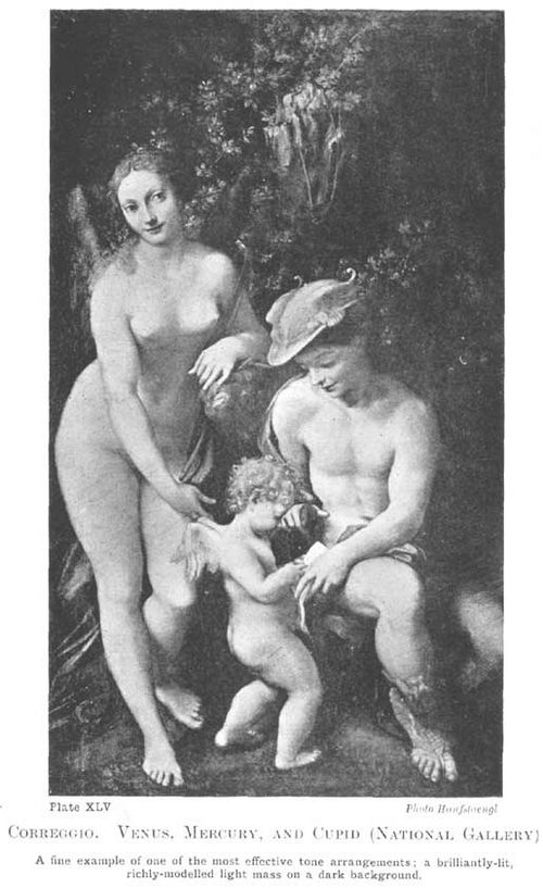
Plate XLV.
CORREGGIO. VENUS. MERCURY, AND CUPID (NATIONAL GALLERY)
A fine example of one of the most effective tone arrangements; a brilliantly-lit, richly-modelled light mass on a dark background.
Photo Hanfstaengl
Large flat tones give a power and simplicity to a design, and a largeness and breadth of expression that are very valuable, besides showing up every little variety in the values used for your modelling; and thus enabling you to model with the least expenditure of tones. Whatever richness of variation you may ultimately desire to add to your values, see to it that in planning your picture you get a good basic structure of simply designed, and as far as possible flat, tones.
In speaking of variety in mass we saw how the nearer these tones are in the scale of values, the more reserved and quiet the impression created, and the further apart or greater the contrast, the more dramatic and intense the effect. And the sentiment of tone in a picture, like the sentiment of line and colour, should be in harmony with the nature of your subject.
Generally speaking more variety of tone and shape in the masses of your composition is permissible when a smaller range of values is used than when your subject demands strong contrasts. When strong contrasts of tone or what are called black and white effects are desired, the masses must be very simply designed. Were this not so, and were the composition patterned all over with smaller masses in strong contrast, the breadth and unity of the effect would be lost. While when the difference of relative values between one tone and another is slight, the oneness of effect is not so much interfered with by there being a large number of them. Effects of strong contrasts are therefore far the most difficult to manage, as it is not easy to reduce a composition of any complexity to a simple expressive pattern of large masses.
This principle applies also in the matter of colour. Greater contrasts and variety of colour may be indulged in where the middle range only of tones is used, and where there is little tone contrast, than where there is great contrast. In other words, you cannot with much hope of success have strong contrasts of colour and strong contrasts of tone in the same picture: it is too violent.
If you have strong contrasts of colour, the contrasts of tone between them must be small. The Japanese and Chinese often make the most successful use of violent contrasts of colour by being careful that they shall be of the same tone value.
And again, where you have strong contrasts of tone, such as Rembrandt was fond of, you cannot successfully have strong contrasts of colour as well. Reynolds, who was fond both of colour and strong tone contrast, had to compromise, as he tells us in 209his lectures, by making the shadows all the same brown colour, to keep a harmony in his work.

Plate XLVI.
OLYMPIA. MANET (Louvre)
A further development of the composition formula illustrated by Correggio's "Venus". Added force is given by lighting with low direct light elimination half-tones.
Photo Neurdein
There is some analogy between straight lines and flat tones, and curved lines and gradated tones. And a great deal that was said about the rhythmic significance of these lines will apply equally well here. What was said about long vertical and horizontal lines conveying a look of repose and touching the serious emotional notes, can be said of large flat tones. The feeling of infinity suggested by a wide blue sky without a cloud, seen above a wide bare plain, is an obvious instance of this. And for the same harmonic cause, a calm evening has so peaceful and infinite an expression. The waning light darkens the land and increases the contrast between it and the sky, with the result that all the landscape towards the west is reduced to practically one dark tone, cutting sharply against the wide light of the sky.
And the graceful charm of curved lines swinging in harmonious rhythm through a composition has its analogy in gradated tones. Watteau and Gainsborough, those masters of charm, knew this, and in their most alluring compositions the tone-music is founded on a principle of tone-gradations, swinging and interlacing with each other in harmonious rhythm throughout the composition. Large, flat tones, with their more thoughtful associations are out of place here, and are seldom if ever used. In their work we see a world where the saddening influences of profound thought and its expression are far away. No deeper notes are allowed to mar the gaiety of this holiday world. Watteau created a dream country of his own, in which a tired humanity has delighted ever since, in which all serious thoughts are far away and the mind takes211refreshment in the contemplation of delightful things. And a great deal of this charm is due to the pretty play from a crescendo to a diminuendo in the tone values on which his compositions are based—so far removed from the simple structure of flat masses to which more primitive and austere art owes its power.

Diagram XXIV.
SHOWING THE PRINCIPLE ON WHICH THE MASS OR TONE RHYTHM OF THE COMPOSITION REPRODUCED ON THE OPPOSITE PAGE IS ARRANGED
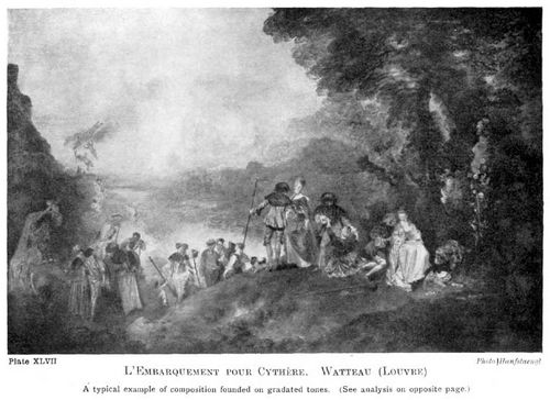
Plate XLVII.
L'EMBARQUEMENT POUR CYTHÈRE. WATTEAU (LOUVRE)
A typical example of composition founded on gradated tones. (See analysis on opposite page.)
Photo Hanfstaengl
But Watteau's great accomplishment was in doing this without degenerating into feeble prettiness, and this he did by an insistence on character in his figures, particularly his men. His draperies also are always beautifully drawn and full of variety, never feeble and characterless. The landscape backgrounds are much more lacking in this respect, nothing ever happened there, no storms have ever bent his graceful tree-trunks, and the incessant gradations might easily become wearisome. But possibly the charm in which we delight would be lost, did the landscape possess more character. At any rate there is enough in the figures to prevent any sickly prettiness, although I think if you removed the figures the landscape would not be tolerable.
But the followers of Watteau seized upon the prettiness and gradually got out of touch with the character, and if you compare Boucher's heads, particularly his men's heads, with Watteau's you may see how much has been lost.
The following are three examples of this gradated tone composition (see pages 210 [Transcribers Note: Diagram XXIV], 213 [Transcribers Note: Diagram XXV], 215 [Transcribers Note: Diagram XXVI]):
Watteau: "Embarquement pour L'Île de Cythère."
This is a typical Watteau composition, founded on a rhythmic play of gradated tones and gradated edges. Flat tones and hard edges are avoided. Beginning at the centre of the top with a strongly accented note of contrast, the dark tone of the mass of trees gradates into the ground and on past the lower right-hand corner across the front of the picture, until, when nearing the lower left-hand corner, it reverses the process and from dark to light begins gradating light to dark, ending somewhat sharply against the sky in the rock form to the left. The rich play of tone that is introduced in the trees and ground, &c., blinds one at first to the perception of this larger tone motive, but without it the rich variety would not hold together. Roughly speaking the whole of this dark frame of tones from the accented point of the trees at the top to the mass of the rock on the left, may be said to gradate away into the distance; cut into by the wedge-shaped middle tone of the hills leading to the horizon.
Breaking across this is a graceful line of figures, beginning on the left where the mass of rock is broken by the little flight of cupids, and continuing across the picture until it is brought up sharply by the light figure under the trees on the right. Note the pretty clatter of spots this line of figures brings across the picture, introducing light spots into the darker masses, ending up with the strongly accented light spot of the figure on the right; and dark spots into the lighter masses, ending up with the figures of the cupids dark against the sky.
Steadying influences in all this flux of tone are introduced by the vertical accent of the tree-stem and statue in the dark mass on the right, by the horizontal line of the distance on the left, the outline of the ground in the front, and the straight staffs held by some of the figures.
In the charcoal scribble illustrating this composition I have tried carefully to avoid any drawing in the figures or trees to show how the tone-music depends not so much on truth to natural appearances 214as on the abstract arrangement of tone values and their rhythmic play.

Diagram XXV.
SHOWING THE PRINCIPLE ON WHICH THE MASS OR TONE RHYTHM IS ARRANGED IN TURNER'S PICTURE IN THE NATIONAL GALLERY OF BRITISH ART, "ULYSSES DERIDING POLYPHEMUS"
Of course nature contains every conceivable variety of tone-music, but it is not to be found by unintelligent copying except in rare accidents. Emerson says, "Although you search the whole world for the beautiful you'll not find it unless you take it with you," and this is true to a greater extent of rhythmic tone arrangements.
Turner: "Ulysses deriding Polyphemus."
Turner was very fond of these gradated tone compositions, and carried them to a lyrical height to which they had never before attained. His "Ulysses deriding Polyphemus," in the National Gallery of British Art, is a splendid example of his use of this principle. A great unity of expression is given by bringing the greatest dark and light together in sharp contrast, as is done in this picture by the dark rocks and ships' prows coming against the rising sun. From this point the dark and light masses gradate in different directions until they merge above the ships' sails. These sails cut sharply into the dark mass as the rocks and ship on the extreme right cut sharply into the light mass. Note also the edges where they are accented and come sharply against the neighbouring mass, and where they are lost, and the pleasing quality this play of edges gives.
Stability is given by the line of the horizon and waves in front, and the masts of the ships, the oars, and, in the original picture, a feeling of radiating lines from the rising sun. Without these steadying influences these compositions of gradated masses would be sickly and weak.
Corot: 2470 Collection Chauchard, Louvre.
This is a typical example of Corot's tone scheme, and little need be added to the description already given. Infinite play is got with the simplest means. A dark silhouetted mass is seen against a light sky, the perfect balance of the shapes and the infinite play of lost-and-foundness in the edges giving to this simple structure a richness and beauty effect that is very satisfying. Note how Corot, like Turner, brings his greatest light and dark together in sharp contrast where the rock on the right cuts the sky.

Diagram XXVI.
TYPICAL EXAMPLE OF COROT'S SYSTEM OF MASS RHYTHM, AFTER THE PICTURE IN THE LOUVRE, PARIS
Stability is given by the vertical feeling in the central group of trees and the suggestion of horizontal distance behind the figure.
It is not only in the larger disposition of the masses in a composition that this principle of gradated masses and lost and found edges can be used. Wherever grace and charm are your motive they should be looked for in the working out of the smallest details.
In concluding this chapter I must again insist that knowledge of these matters will not make you compose a good picture. A composition may be perfect as far as any rules or principles of composition go, and yet be of no account whatever. The life-giving quality in art always defies analysis and refuses to be tabulated in any formula. This vital quality in drawing and composition must come from the individual artist himself, and nobody can help him much here. He must ever be on the look out for those visions his imagination stirs within him, and endeavour, however haltingly at first, to give them some sincere expression. Try always when your mind is filled with some pictorial idea to get something put down, a mere fumbled expression possibly, but it may contain the germ. Later on the 217same idea may occur to you again, only it will be less vague this time, and a process of development will have taken place. It may be years before it takes sufficiently definite shape to justify a picture; the process of germination in the mind is a slow one. But try and acquire the habit of making some record of what pictorial ideas pass in the mind, and don't wait until you can draw and paint well to begin. Qualities of drawing and painting don't matter a bit here, it is the sensation, the feeling for the picture, that is everything.
If knowledge of the rhythmic properties of lines and masses will not enable you to compose a fine picture, you may well ask what is their use? There may be those to whom they are of no use. Their artistic instincts are sufficiently strong to need no direction. But such natures are rare, and it is doubtful if they ever go far, while many a painter might be saved a lot of worry over something in his picture that "won't come" did he but know more of the principle of pictorial design his work is transgressing. I feel certain that the old painters, like the Venetians, were far more systematic and had far more hard and fast principles of design than ourselves. They knew the science of their craft so well that they did not so often have to call upon their artistic instinct to get them out of difficulties. Their artistic instinct was free to attend to higher things, their knowledge of the science of picture-making keeping them from many petty mistakes that a modern artist falls into. The desire of so many artists in these days to cut loose from tradition and start all over again puts a very severe strain upon their intuitive faculties, and keeps them occupied correcting things that more knowledge of some of the fundamental principles that don't really alter and that are the same in all schools would have saved them. Knowledge in art is like a railway built behind the pioneers who have gone before; it offers a point of departure for those who come after, further on into the unknown country of nature's secrets—a help not lightly to be discarded.
But all artifice in art must be concealed, a picture obviously composed is badly composed. In a good composition it is as though the parts had been carefully placed in rhythmic relation and then the picture jarred a little, so that everything is slightly shifted out of place, thus introducing our "dither" or play of life between the parts. Of course no mechanical jogging will introduce the vital quality referred to, which must come from the vitality of the artist's intuition; although I have heard of photographers jogging the camera in an endeavour to introduce some artistic "play" in its mechanical renderings. But one must say something to show how in all good composition the mechanical principles at the basis of the matter are subordinate to a vital principle on which the life in the work depends.
This concealment of all artifice, this artlessness and spontaneity of appearance, is one of the greatest qualities in a composition, any analysis of which is futile. It is what occasionally gives to the work of the unlettered genius so great a charm. But the artist in whom the true spark has not been quenched by worldly success or other enervating influence, keeps the secret of this freshness right on, the culture of his student days being used only to give it splendour of expression, but never to stifle or suppress its native charm.